
Photo courtesy of Cape & Coast Bank
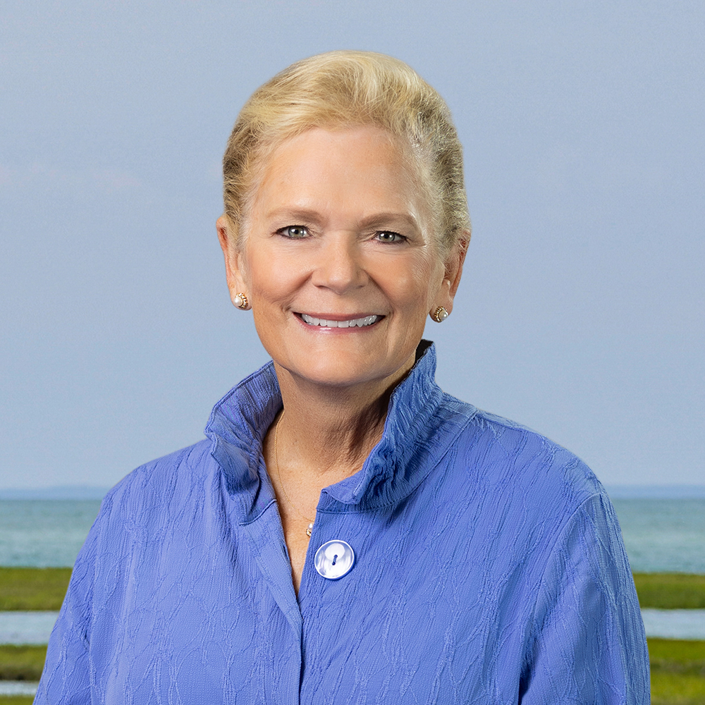
Lisa Oliver
President and CEO, Cape & Coast Bank
Industry experience: 30
After 104 years, The Cooperative Bank of Cape Cod has become Cape & Coast Bank. Along with a new name, the bank is updating its branding and adopting a new tagline: “Powering local.” The Hyannis-based bank also redesigned its website as it looks to enhance its customers’ online and mobile experiences. The changes come as Lisa Oliver will be retiring as the leader of the $1.64 billion-asset bank after eight years.
Oliver was the first female CEO in the bank’s history. Additionally she oversaw saw the completion of a $12 million renovation of the Bank’s headquarters and a 72 percent increase in bank assets during her tenure. She also established the bank’s foundation in 2018, which has distributed 3 percent of annual earnings to charitable causes across Cape Cod.
Q: Why was now the time to change the name and give a new look for the bank?
A: The rebrand celebrates 100 years of history while really positioning us to continue to serve clients effectively for the next 100 years. We felt, with a CEO change and some of the upgrades that we’ve made to online banking and online account opening, it was a great time to wrap it all into one bundle, honor all of those past accomplishments and set the stage for the new leadership.
As a small community bank, one of the key words we use all the time is “relevancy.” The pace of change over the last 15 years across the world, across the country and certainly in financial services, the pace has grown geometrically. We really wanted to rebrand, modernize our identity, make it easier to say and really simplify messages – make it easier for people to remember us. I think that’s been a big driving force behind our name change too. It’s long, and it kind of gets lost in the crowd of banks. I think it overall positions us with better accessibility for our clients.
Q: What went into the naming process, and also the new tagline?
A: This is something that has not been a quick thought or a quick process. Quite frankly, we started talking about it before COVID. We had close to two years working through it with third-party advice. We recognize there was potential risk of changing the name as well as opportunity, and we wanted to make sure we analyzed all of those various aspects, including asking non-clients, clients across the Cape bridges on the mainland and those here on the peninsula what they thought of when they thought of banks. We spent a lot of time talking about unaided awareness, how many people actually knew who we were by our name alone. And we wanted to make sure that the name played more of a part in helping us become more relevant and easily remembered.
I think we talked about 100 different iterations of names in the first pass, which then knocked down to 40 different names. Then it’s not just the names, but it’s the color schemes. What are we trying to say by the brand name? The piece of all of this that rang true over and over again was the power of local. The importance of having a call center and the president of the bank and your face-to-face individuals that you see in the branches who are all local to the local community, really being a powerful statement on what it means to “power local.”
Q: What was the thought process behind the colors and logo you ended up choosing?
A: We knew that the colors really embodied the colors you see here on Cape Cod: blue waves, the green grasses, the colors of sand on the beach. It kind of captured what you were going to get being here on the Cape or even along the coastline. When we thought about the color scheme, and how a wave is a modernization of the wave that was part of The Cooperative Bank of Cape Cod logo. The old logo was preceding the name on the left, [made of] some stripes or some curved wave-type symbols. This one just modernizes that. It gives some color to it and it’s really representative of this geography in the market that we’re in.
Q: What’s it like to see the bank entering this new era, and what stands out about the bank’s growth overall during your tenure?
A: I was going through some cabinets, and I found some of the bank’s old statements of condition, which is now something you get when you go on the website and you look at our financial information. But these were old tri-fold documents and you realize how not even that long ago – call it 30 years ago – we were still a very paper-based organization. You couple that with being 104 years old, if you take it back that far to where we’ve come, the growth that we’ve seen in the last 10 years has been substantial.
With that growth we haven’t grown people, per se, over that time, but we’ve really grown capabilities. That makes me extremely proud. Especially, before you throw COVID into it, where you have this full stop for a minute to figure out a change of priorities, and then you get ramped up and going again. We also are giving money to the community through a foundation that we’ve created purposely to ensure we do what our mutual bank charter says, which is keep people’s money safe and sound. Hold people’s deposits, make loans to those who need it, and what we do at the end of the day from our operations is that profit gets handed back to the community. The fact that we can still do that while being part of the pack and offering best-in-class services and a fresh brand, and being an employer of 175 people on Cape Cod, and getting great feedback.
All of that just is a wonderful, wonderful feeling for me to step aside knowing it’s in phenomenal hands. Eric [Porter, the incoming CEO] is going to do an amazing job. He’s been part of this whole transition with us. These programs, the brand: He’s been a decision maker all the way since he stepped in the door.
Lisa Oliver’s Five Favorite Ski Mountains
- Vail, Colorado
- Jackson Hole, Wyoming
- Big Sky, Montana
- Alta, Utah
- Belleayre, NY